Let’s talk about something nobody likes to admit: your PDFs might be costing you business.
I’m not saying your pricing is wrong or your services aren’t valuable. I’m saying that the way your proposal or welcome packet looks might be quietly screaming, “I threw this together in Word at 11 p.m.” And guess what? Your potential client hears it loud and clear.
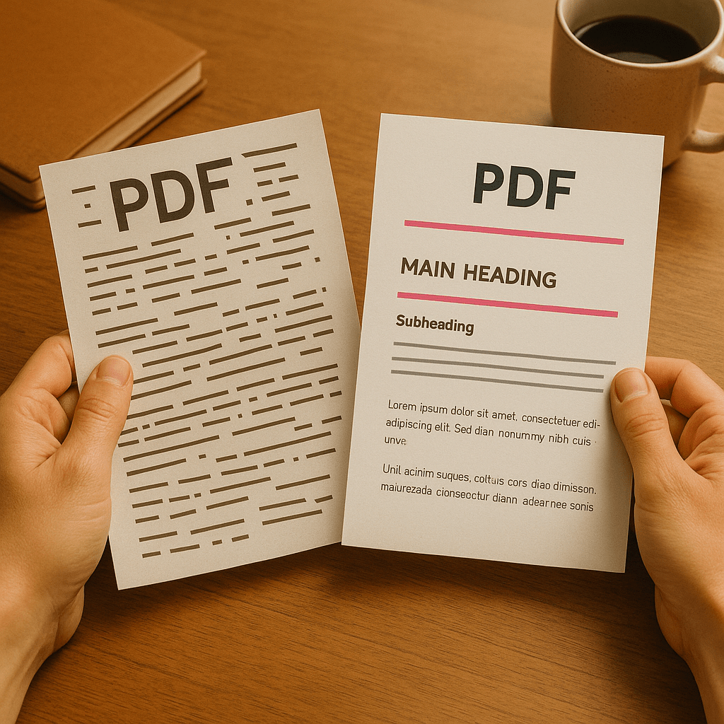
We all want to believe people buy based on value, experience, and expertise. But here’s the truth: they buy based on trust. And visuals build trust faster than words ever can. A clean, cohesive PDF layout says “I’m professional, organized, and I’ll treat your project the same way.” A cluttered, inconsistent one says “good luck figuring this out.”
The First Impression Problem
When someone opens your proposal, they’re not just reading; they’re scanning, judging, and forming opinions in seconds. If the margins are uneven, the logo’s fuzzy, and the fonts look like a middle-school book report, that little voice in their head starts whispering:
“If this person can’t get their own stuff together, how will they handle mine?”
And it’s not unfair. Presentation signals care. Sloppy presentation signals rush.
This doesn’t mean you need to be a designer. It means you need to understand that every element (the spacing, colors, headings, and flow) affects how your reader feels about you. Whether you realize it or not, your PDFs are doing sales work long before you ever get on a call.
Design Isn’t Decoration…It’s Communication
Too many small business owners treat design like it’s optional flair. It’s not. It’s the delivery system for your message.
Good design directs attention where you want it. It creates hierarchy, clarity, and confidence. Bad design makes people work to understand what they’re looking at, and nobody likes extra work.
If your pricing table blends into your paragraph text, or your testimonials are squished into the margins, your reader won’t just skim over them; they’ll miss them. You could have nailed your offer, but if your layout doesn’t guide the eye, you’ve wasted half your effort.
A polished PDF doesn’t distract. It frames your message so the good stuff actually lands.
The “Canva Syndrome”
Here’s where I give you some tough love: just because you used Canva doesn’t mean your design is good.
Canva is a fantastic tool when used intentionally. But too many people start with a template and call it done; never adjusting font hierarchy, white space, or alignment. That’s how you end up with a document that technically “looks better” but still feels off.
Design isn’t about fancy graphics or trendy fonts. It’s about restraint. It’s knowing when to leave space, when to emphasize, and when to stop adding. The people who win with Canva are the ones who simplify, not the ones who layer fifty shapes and a gradient background.
The Subtle Art of Looking Like You Charge More
Here’s the wild thing: polished PDFs don’t just look better…they perform better.
People associate visual quality with professionalism. That means your pricing looks more justified, your services feel more valuable, and your timeline feels more trustworthy simply because your materials read smoothly and look intentional.
Your clients don’t consciously think, “Wow, these margins are consistent; I bet they’ll hit deadlines.” But subconsciously? That’s exactly what’s happening.
A clean design quietly tells your reader that you’re competent and capable…that you pay attention to the details they can’t see yet.
The Bottom Line
Pretty matters. It’s not vanity; it’s psychology.
If your PDFs look disorganized, people assume you are. If your PDFs feel calm, clear, and confident, people assume you are.
You don’t need to be a designer; you just need to stop treating design like an afterthought. Your words can convince, but your layout sells.

Leave a comment