Here’s the truth nobody wants to hear: Most people’s homepages look like they were built on GeoCities in the early 2000s…or slapped together using a “generic WordPress template” that still has the default lorem ipsum hiding somewhere in the footer.
And honestly? It’s not because people are bad at websites.
It’s because they treat their homepage like a directory instead of what it actually is: a first impression. A five-second handshake. A “please don’t click away, I promise I’m normal” moment.
But when you try to cram everything you do (every service, every accomplishment, every stray thought you’ve ever had about your business) onto the front page? Visitors don’t think, “Wow, what a multi-talented professional.” They think, “Oh no. I’m tired. Where’s the exit?”
And they leave.
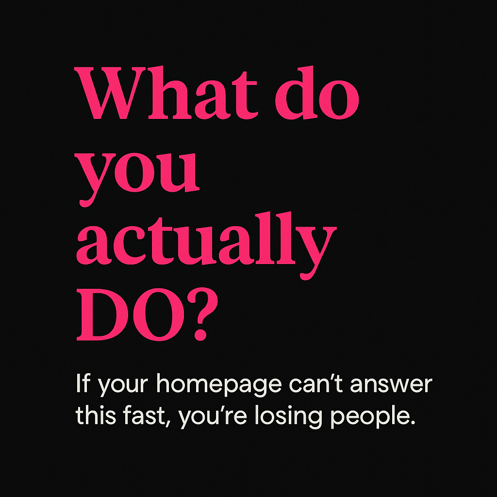
The Real Problem: People Don’t Read Homepages…They Skim Them
You’ve got five seconds. Five.
In that tiny window, your reader is subconsciously deciding:
- Do I understand what you do?
- Do I understand who it’s for?
- Do I trust you?
- Do I know what I should click next?
If the answer to any of those is “ehhhh…maybe?” they’re gone.
And overwhelmed solopreneurs, homesteaders-turned-entrepreneurs, service providers with 14 plates spinning in the air, tech-avoidant founders, and literally anyone who’s ever DIY’d their website at 1 a.m. are the most vulnerable to this chaos spiral.
Because the instinct is: “I don’t want anyone to miss anything…so let me add everything.”
But in trying not to lose information, you lose the reader.
What a Confusing Homepage Is Actually Costing You
A messy homepage isn’t just an aesthetic issue. It’s a business problem.
Here’s what it quietly steals from you:
- Time
- If people don’t understand your offer quickly, they’re not booking calls…which means you’re wasting hours doing the “education” work manually in your inbox or DMs.
- Money
- Every bounced visitor is a missed lead. And confusing homepages bounce hard.
- Mental Load
- Every time you look at your own site and cringe…that’s energy you could’ve used somewhere else.
- Credibility
- If the homepage looks cobbled together with duct tape and good intentions, people question whether your work is polished.
How I Learned This the Hard Way (A Little Story About My Own Homepage)
Before I rewrote my homepage a while back, it was…well…a lot.
Too long. Too detailed. Trying to say everything at once. Not showing why I was the expert or what outcome clients could expect.
Basically a giant wall of “here’s all the ways I can help, please be impressed.”
It wasn’t a homepage. It was a novel.
So I tore it apart.
Here’s what I changed:
- Clarified the offer (plain English, front and center)
- Simplified everything (menu, CTA, layout, sections)
- Added a Resource Library section with weekly articles so the homepage didn’t have to carry all the weight
And the result?
I suddenly felt confident sharing my own website link (always a good sign). My page views went up. And people actually started booking consult calls…without me having to explain the basics over and over.
Funny how clarity works.
And because every business evolves, I’m gearing up to do another homepage review soon; about six months after my last one.
Because even the most streamlined site can quietly bloat again if you’re not paying attention. A homepage is something you check in with regularly, like a garden. If you don’t prune it, the weeds take over.
So… What Should Your Homepage Actually Do?
Honestly? Less than you think.
Here’s what matters:
- Start with a promise, not a poem.
- Skip the inspirational monologue.
Tell people what you do and how it helps them.
- Skip the inspirational monologue.
- One clear next step.
- Book a call.
- Download a guide.
- Send an inquiry.
- Pick one.
- Copy that sounds like a real human.
- The fastest way to lose someone is to sound like a corporate handbook.
- Cut 40% of your text.
- Yes. Forty. Your readers will survive.
- Get to the emotional point.
- People want to know: “Will this make my life easier?”
- Not: “Here’s a complex list of my value propositions.”
A Quick Before/After Example
Before:
“We provide comprehensive solutions for entrepreneurs seeking improved administrative and operational support to enhance business productivity.”
After:
“You don’t need more ‘solutions.’ You need breathing room.
I help you clean up the back end so running your business actually feels manageable again.”
See the difference?
The first sounds like someone wrote it inside a boardroom. The second sounds like someone wrote it at their kitchen table…and actually understands your life.
Your Homepage Should Feel Like a Doorway, Not a Directory
Clean. Warm. Inviting. Focused.
Not a buffet of options. Not a family scrapbook. Not a giant pile of “well, I didn’t want to leave anything out.”
Just a clear first step.
And here’s the part most business owners forget: your homepage isn’t a “set it and forget it” project. It’s a living thing. It changes as you change. As your offers grow. As you get sharper about who you serve and how you serve them.
I’m getting ready to review mine again (just six months after the last update) because even the most streamlined site can quietly pick up clutter. A new section added here, an extra link dropped there, a sentence you meant to shorten but never did…it happens.
Checking in regularly isn’t a chore. It’s maintenance. It’s how you make sure your website still reflects who you are now, not who you were last year.
A clear homepage is a gift to your visitors. But honestly? It’s a gift to future-you, too.

Leave a comment