There’s a special kind of dread that hits when you open an old slide deck and immediately think, “Oh…yikes.”
The fonts don’t match, the images feel like they crawled out of a 2006 stock photo vault, and there’s that one slide with seven bullet points stacked like a Jenga tower of regret.
Look, you’re not alone. We’ve all created decks that made sense at midnight and fell apart the second actual daylight hit them. The problem isn’t that you don’t know your message. It’s that your slides aren’t telling the same story you are.
And when the visuals don’t match the voice? Everything feels harder.
Your Material Isn’t the Issue, The Delivery Is
Here’s the truth: you do know what you’re talking about. You’ve lived it, built it, or learned it the hard way. Your message is solid.
But your slides? Sometimes they’re…not.
Common offenders include:
- Text-heavy slides that look like someone copy-pasted their entire brain onto one page
- Ten fonts fighting for dominance like reality show contestants
- Random screenshots that seemed helpful at the time but now scream “I didn’t have a plan”
- Visuals that don’t support your message…or worse, distract from it
When your slides are cluttered, you feel cluttered.
You start reading instead of speaking. You shrink instead of leading.
And the whole thing becomes a tug-of-war between clarity and chaos.
Slides Matter More Than We Want to Admit
A clean, intentional slide deck isn’t about being “fancy.” It’s about giving your audience something to latch onto while your words do the heavy lifting.
Good slides do a lot of quiet, behind-the-scenes work:
- They anchor your ideas
- They give your message room to breathe
- They help your brain stay on track when nerves kick in
- They set a tone before you even open your mouth
And honestly? Nothing boosts presentation confidence faster than clicking to the next slide and thinking, “Okay…that actually looks good.”
How to Tell When Your Slides Are Working Against You
A quick diagnostic checklist:
- You apologize for your slides before the presentation starts
- People are squinting, taking pictures, or whispering, “What does that say?”
- You’re reading every word off the screen
- Every slide looks like a paragraph in a trench coat
- Your audience looks…lost
- You feel lost
If any of this hit a little too close to home, don’t panic. This is fixable, and it’s easier than most people think.
Small Fixes, Big Difference
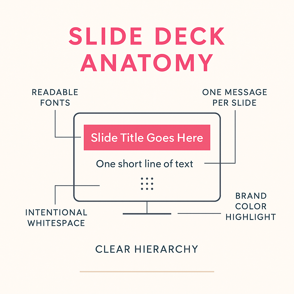
If your slide deck is giving you “I made this in a rush” vibes, start small:
- One idea per slide
- If a slide is trying to do the work of three, it’s doing the work of none.
- Bigger fonts, fewer words
- Your audience should be able to read it without leaning forward like detectives in a crime drama.
- Visual anchors > bullet list marathons
- Charts, icons, photos…anything that reinforces your point instead of repeating it.
- Brand colors, used with intention
- A highlight here. A header there. Not a full-blown color explosion.
Clean slides don’t need to be complicated: they just need to be purposeful.
Your Slides Shape Your Presence
A good deck doesn’t just look better. It makes you calmer. Clearer. More grounded.
When your slides are clean and your message is supported, you show up differently: more confident, more prepared, and more like the leader your audience already believes you are.
Show up like you mean it.
Let your slides tell the same story you’re telling: the one you actually want people to remember.

Leave a comment