Here’s the thing about websites: they don’t get graded on effort. No one’s giving you points for having a “pretty good” homepage if the people landing there can’t figure out what you do – fast.
I’m talking five seconds or less.
Because that’s about how long it takes for someone to decide if they’re in the right place, if you’re worth their time, and if they know what to do next. And if your homepage fails that little pop quiz? Most visitors are already gone.
Why Most Homepages Fail (and It’s Not Just Design)
A homepage can look decent and still leave people confused. Common copy slip-ups include:
- Vague headlines — “Helping you reach your potential” doesn’t tell me anything.
- Too much me, not enough you — Talking all about your business instead of your client’s problem.
- Scattered calls-to-action — Three buttons, five links, no clear path forward.
- Buried clarity — Visitors have to scroll halfway down to figure out what you actually do.
None of these are design flaws; they’re messaging flaws. And they’re fixable.
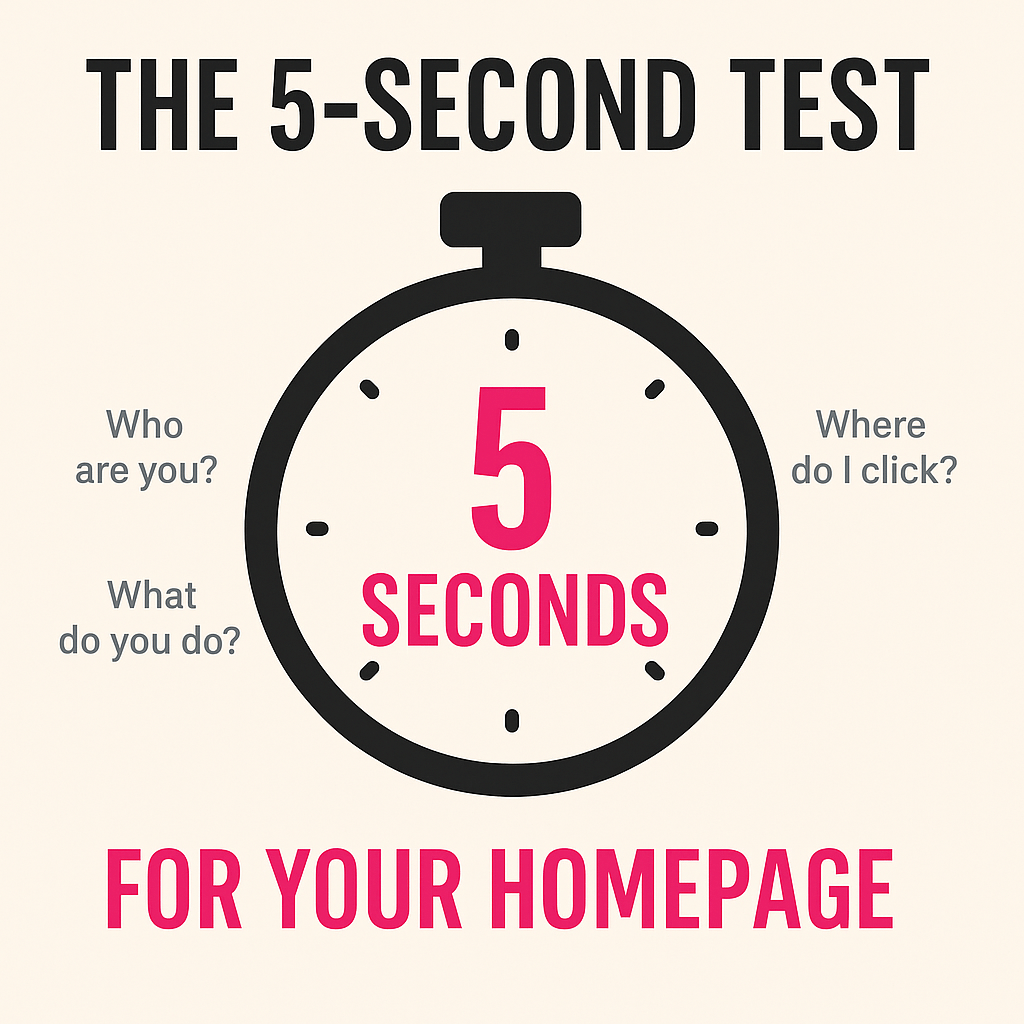
The 5-Second Test (Try It Right Now)
Here’s a simple experiment:
- Pull up your homepage.
- Ask a friend (or yourself) to look at it for five seconds.
- Then close the screen and answer:
- What do you do?
- Who do you do it for?
- What should they do next?
If those three answers aren’t crystal clear, your copy needs a polish.
Quick Copy Fixes You Can Make Today
You don’t need to rewrite your whole website. Start here:
- Simplify Your Headline
- One clear sentence that says what you do and who it’s for. “Custom leather goods for everyday carry” is better than “Crafting unique experiences.”
- Write for Them, Not You
- Swap “I’ve been in business 10 years” for “Here’s how I solve your problem.” Visitors care about what’s in it for them.
- One Call-to-Action (CTA)
- Decide what you actually want people to do, book a call, grab a free guide, fill out a form, and make that the main action.
- Above-the-Fold Audit
- Whatever matters most (what you do + CTA) should show up before anyone scrolls. Don’t bury the lede.
- Mobile Check
- Read your homepage on your phone. If the headline wraps weird or the button disappears, fix it. (Copy tweaks can solve more of this than you’d think.)
Why This Matters
A messy homepage isn’t just embarrassing, it’s expensive. Every confused visitor is a missed lead, a lost client, or someone who assumes you’re not legit.
Even if your actual work is fantastic, unclear or cluttered homepage copy makes people click away before they ever see it.
What This Really Comes Down To
You don’t need a brand-new website to fix this stuff. Most of the time, the problem isn’t the layout or the design at all: it’s the words.
A clear headline, a focused call-to-action, and copy that talks to your visitor instead of about yourself will take you further than a flashy redesign ever will.
I don’t do websites. I don’t fiddle with code or design fancy graphics. But I do believe in the power of a few smart copy tweaks to turn “meh” into “oh, this makes sense.”
Final Thought
Your homepage is your front porch. If it’s confusing, cluttered, or too “meh” to stick around…people won’t.
Give it the five-second test. If the answers aren’t instant, it’s not about redesigning your whole site; it’s about making the words work harder for you.
Sometimes all it takes is a headline swap, a tighter call-to-action, and a little breathing room in the copy. Small changes. Big difference.

Leave a comment